
Building the blue dot
environmental intelligence platform
Ambee is an environmental intelligence company providing hyper-local information on factors like air quality, pollen, weather, fire. Over the years, Ambee has built a name across the globe by providing accurate and actionable real-world evidence to brands like Kimberly-Clark, Bosch, Airbus, GSK, Bayer, Nike, WPP.


Why rebrand a company
that’s already doing great?
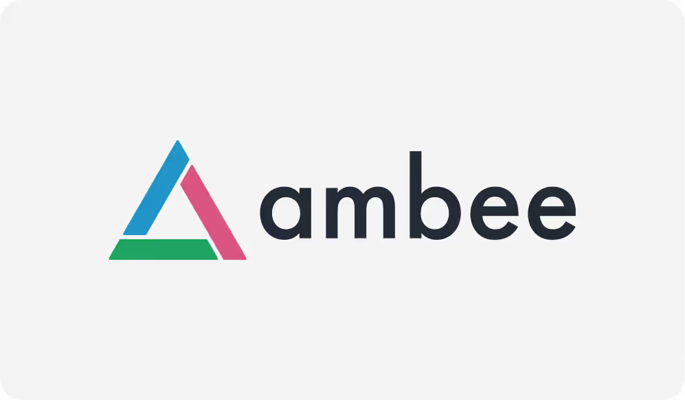
The old logo showed the four elements: earth (green), fire (red) and water (blue), with air in between. While this logo served the purpose for the initial years, the founders realised it did not bring out the very strong founding story that drives every action at Ambee.
Unveiling an untold story
As we were designing the website, which is a reflection of the brand itself, we decided to get back in touch with the founding purpose, look for the brand story that already existed but wasn’t told yet.
“The Earth is the only world known so far to harbor life. There is nowhere else...”
guiding principle for Ambee.

Even a degree of difference matters

It can be the difference between life and death as global temperatures shift by a degree. It can be the shift from breathing to breathless as air quality changes by a degree.
To highlight Ambee’s strong stand on the importance of a degree of difference to protect the pale blue dot we call Earth, we chose ‘The Pale Blue Dot’ as the principal element of Ambee’s identity.
Enters
The Pale Blue Dot

This single pixel informed all other pixels across the website and the brand
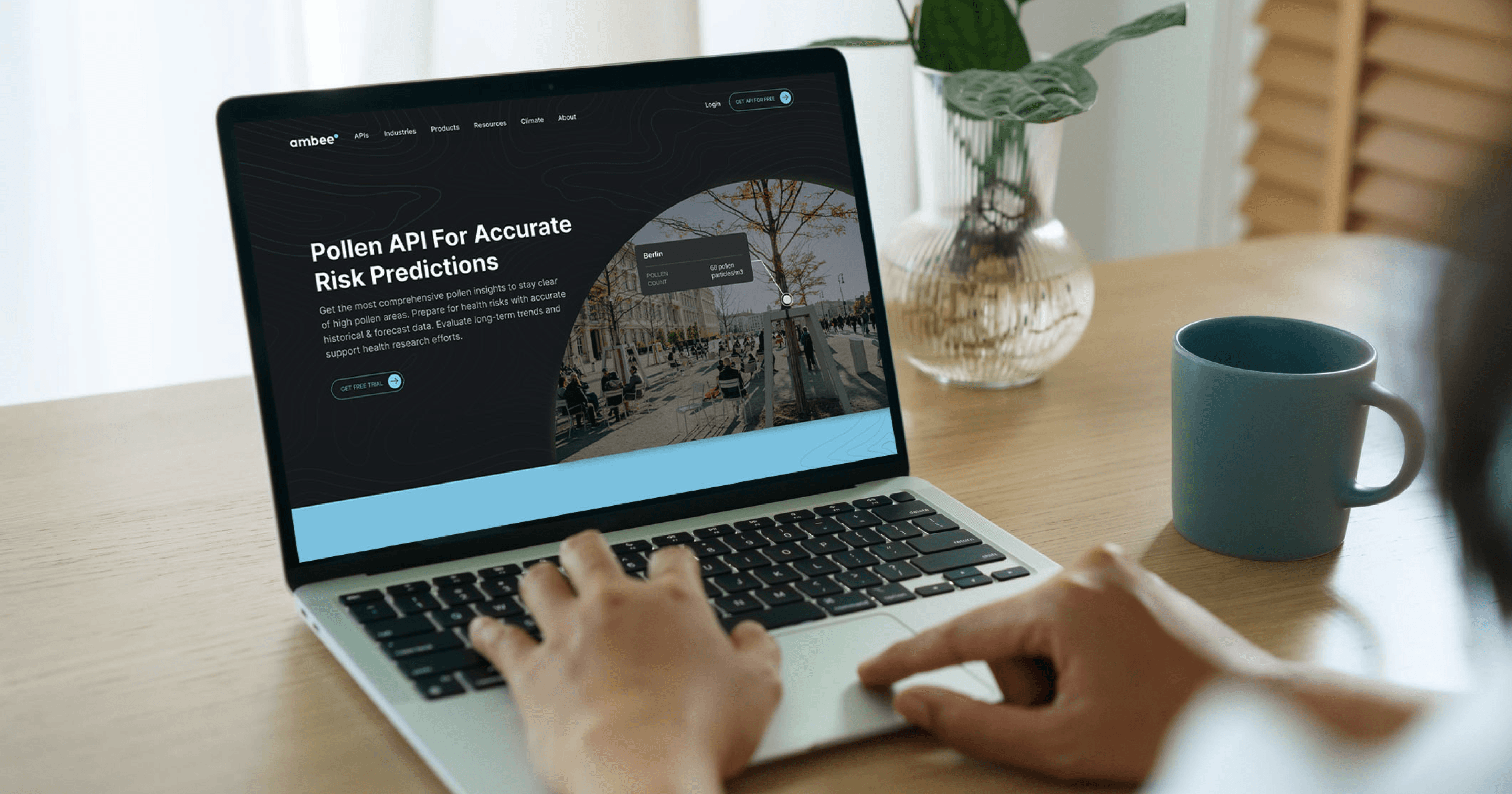
Team Ambee holds our one pale blue dot close to their hearts, literally.

“Our new goals necessitated a fresh look and approach – something that can tell the world that we aren’t just solving a problem for ourselves but future generations as well.”

Co-founder & CEO, Ambee