Designing a system for
now and the future
Birla Sun Life Insurance’s multiple products





Since 2000, ABSLI, with its tech-first approach to developing new products, has acquired a user base of 19.3 lakh customers.
Service Buddy
For agents to keep track of their respective customers.Leap
For agents to help new customers with completing their application.Customer Portal
For customers to have easy access to all their policies.
These products served different functionalities, and without a unified design system, ABSLI faced a fragmented UX, diluted brand presence, and significant inefficiencies in design and development. Creating a more streamlined user experience across all products and consistency across channels was a huge challenge.
ABSLI approached us to resolve these challenges and develop a unified design system and visual library for all its current products.
Creating a system without breaking the UX
Maintaining a cohesive user experience across three products with varying functionalities was a significant challenge. The concerning factor was that the existing products might have inconsistencies in UI elements across different features. Implementing the design system involved significant refactoring to ensure the UX is not disrupted.
The design system was built with user familiarity in mind and we also implemented clear visual cues to differentiate product-specific functionalities.
This consistency reduces users’ confusion, helps them learn the product faster, and translates to a smoother user experience with fewer disruptions.
Balancing modernity with usability
ABSLI users are spread across a wide age spectrum. The legacy customers are accustomed to traditional design elements; on the other hand, the younger audience seeks more modern aesthetics and intuitive interactions.
Through multiple user interviews, we were able to understand their core needs to bridge the generational gap. To strike a balance, we incorporated modern visual elements while prioritising core functionalities.
Not all red is negative
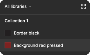
Colour plays a critical role while designing user experiences, and overly strong colours can sometimes be overwhelming. To ABSLI, the colour red represented the brand’s heartbeat. Using red to convey a sense of energy and excitement posed a unique challenge as it is usually a colour associated with negative emotions.
We solved this problem by adding red as an accent colour, toning down the UI with a minimal design. This created a balance in the intensity of red, ensuring it didn’t overwhelm users while still keeping it as a key element of ABSLI’s identity.
From scattered to streamlined
Considering the complexities of implementing design systems, we developed a dedicated visual library that serves as a central repository of information. It displays all the components and detailed instructions on how and when to use each component, along with best practices, accessibility, and potential use cases. The visual library reduces the time spent searching for information, allowing designers and developers to focus on creating user-centric experiences.
A system that grows
As ABSLI continues to innovate and develop new products, a future-proof design system was paramount. We introduced a design system with multiple variants and styles to allow customisation and tailor components to use cases. By prioritising scalability, the design system future-proofs ABSLI’s design language.
Need help in optimising your product experience for AI?
that impacts the masses?